prada's primary colors
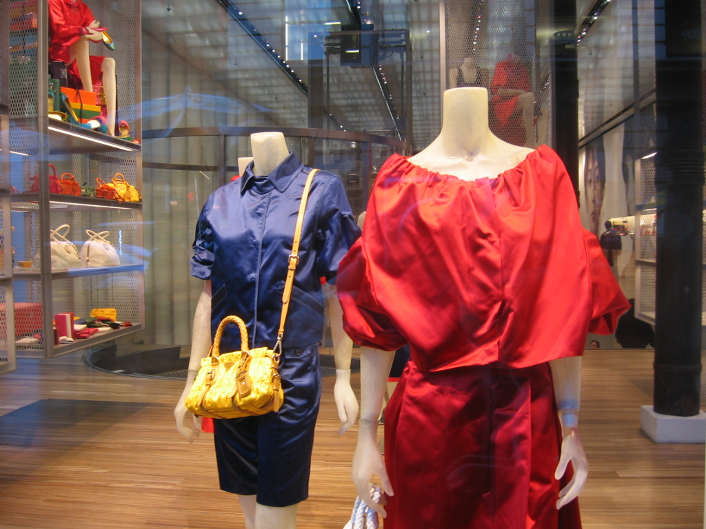
On Black Friday I walked by the Prada store in SOHO. I was so pleased to see simple frocks in simple colors. The contradiction of the rich fabric and the repetition of the dresses in the window lived up to the design legacy that Rem Koolhaas has set in the space. Don't these mannequins look just like Crayola crayons lined up alongside each other?

It is certainly a change from the black and beige on the runways of the fall collections. The silk/satin gives the colors so much more "pop"--and a completely different range of shades. It is much more difficult to get this amount of saturation with cotton.
posted by odilean at 9:17 PM
![]()


2 Comments:
I love this display. And the yellow looks absolute wonderful in the middle of this dull, crap season.
The minimalism yet quirkiness of Prada makes me feel joy. Love the primary colors next to each other.
Post a Comment
<< Home